Introducing Monetization to Storygrounds
EARLY STARTUP · DESIGN FOR CROSS-PLATFORM
INTRODUCTION
Storygrounds is a startup aiming to revolutionize the webcomic space by creating new ways for readers to connect with creators and producing original webcomics.
In November 2024, we implemented our first monetization system through content gating webcomic episodes across our responsive web app.
KEY SKILLS
Prototyping, user journeys, responsive design, payment system integration
THE TEAM
SG Product Team (1 designer, 2 engineers, 1 product manager)
TIMELINE
Oct - Nov, 2024
TACKLING BUSINESS GOALS
Content Gating Episodes
With our upcoming launch, the team recognized the need to introduce a monetization strategy that balances revenue generation with user retention.
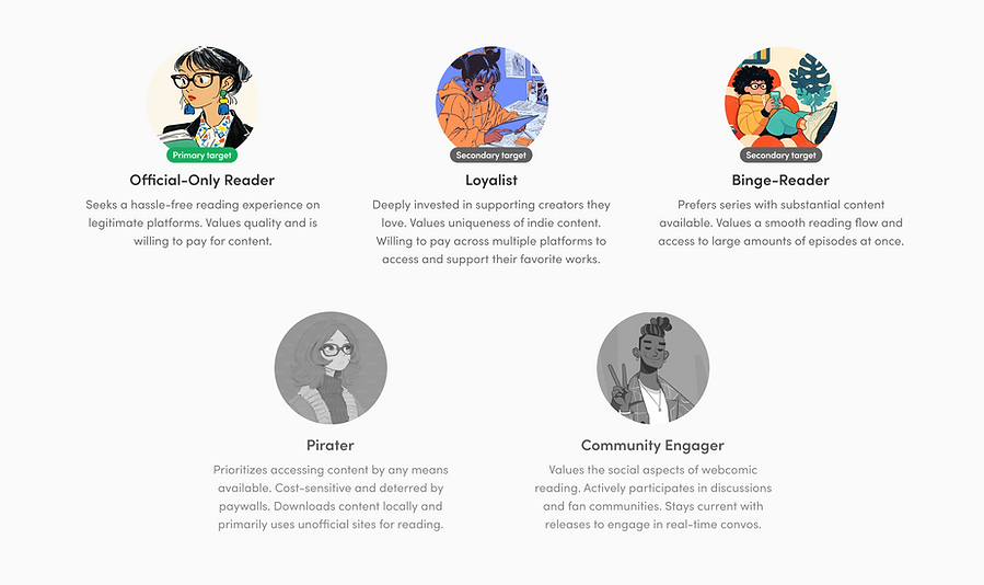
THE USERS WHO ARE IMPACTED BY MONETIZATION
Our monetization strategy targets reader personas identified through early adopter interviews. Our primary target, the Official-Only Reader, valued quality content and paid through legitimate platforms. Secondary personas, the Loyalist and Binge Reader, were open to spending when it supported creators or granted bulk access. These insights directly influenced our purchasing and checkout flow design.
PROCESS
Breaking down the PRD
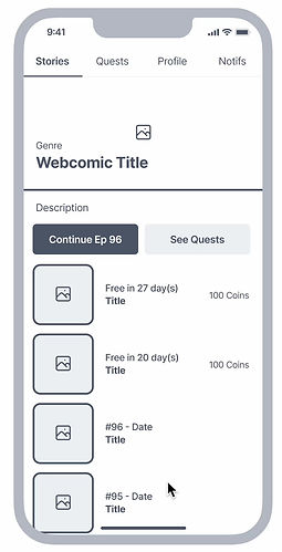
Aligning with industry standards for webcomic apps, monetization is introduced through gating recently released episodes.
We chose to use a virtual currency system (coins) to drive pricing flexibility, integrate gamification, and reduce spending friction.
Due to limitations within a web app space, we opted to implement Stripe as a third party solution to accept online payments for coins.
BACKGROUND RESEARCH + STAKEHOLDER ALIGNMENT
This was an introduction of a brand new feature, on top of being a multilayered one, so I wanted to reduce everything down to the user flow before starting any design work.
During this phase, my time went into researching the steps of Stripe integration, email automation, competitor research, and establishing common understanding of our user journey amongst the team.

PURPOSE OF CREATING THIS USER FLOW
1. Alignment between the design team, engineers, and PM/CPO
What internal checks are happening on the backend?
What data/webhooks are required for sending confirmation receipts?
What areas of purchasing coins and unlocking episodes are handled on our end, and what areas are handled by Stripe?
2. Understanding Stripe integration
What happens when a payment fails?
How are customer receipts handled for coin purchases?
3. Mapping the ideal user journey to unlocking an episode
How might we reduce friction in the purchasing flow?
What edge cases exist (e.g. when a user has enough coins to unlock a single episode, but not in bulk/multiple episodes)?
During wireframing, I identified a critical UX issue in the payment flow: users were being redirected to Stripe to purchase coins, then returning to a different screen than where they started. This created a disorienting experience where users lost context of their original intent - unlocking specific episodes.
To solve this, I redesigned the flow to first let users make their episode selection in the locked episode sheet, then proceed to payment. Their selection is preserved throughout the Stripe payment process, and they return right where they left off. While this added one step, it created a more coherent experience by maintaining user context throughout the payment journey.


FINAL OUTCOME HIGHLIGHTS
Design Solutions and Trade-offs
After establishing our user flow and basic wireframes, we faced several key decisions that would shape the final monetization experience. Each decision required careful consideration of multiple stakeholders - from users who expect a smooth purchase experience to engineering's constraints around backend infrastructure.
THE NEW COIN SHOP
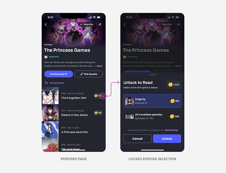
Bottom sheet vs. full page
USER SCENARIO
Readers want to explore pricing and unlock options without losing their place in the app experience. Feeling pressured or isolated in a purchase flow can create hesitation and a sense of forced commitment.
SOLUTION
To maintain visual context and reduce disruption, I designed the first step to unlocking an episode as a modal/bottom sheet. This keeps the current page visible, reducing friction and making the initial decision feel lower stakes.
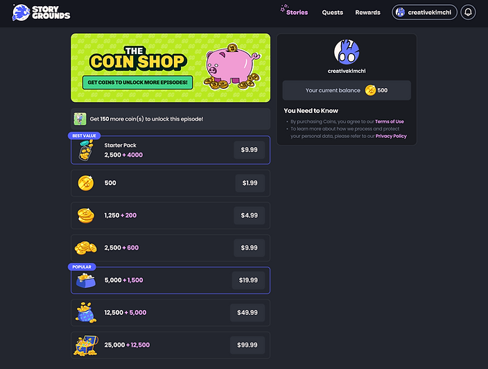
Soft currency coin shop
USER SCENARIO
Readers who wants to unlock an episode but don't have enough coins, have to scan across multiple soft currency purchase options. Calculating how many coins you actually need can be time consuming and discouraging.
SOLUTION
The reader's current balance is prominently displayed, along with a banner showing the remaining coins needed. A streamlined list view of coin packages allows for quick scanning, with visually distinct icons that guide purchasing decisions efficiently.

Technical trade-offs
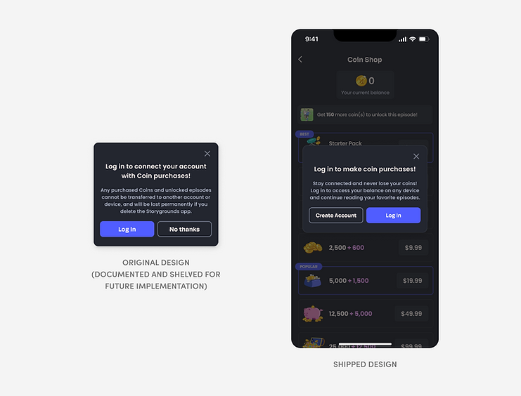
PRIORITIZING MARKET OBJECTIVES
My PM and I aligned on allowing guest accounts to make purchases, aiming to reduce friction and drive revenue. The design included clear messaging about purchases not being transferrable between devices for guest accounts.
STRATEGIC PIVOT
Upon engineering review, implementing guest purchases would significantly impact our development timeline due to backend limitations. We ultimately prioritized shipping on schedule, requiring users to log in for purchases and adjusting the messaging accordingly.
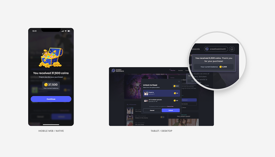
Adapting interactions across devices
Working with a responsive web app means designing for 3 different devices, which in some cases demands different interaction patterns. For example, on mobile, a full-screen overlay provides focused confirmation of successful Stripe transactions with a clear touch target for next steps. In contrast, desktop and tablet users see a non-intrusive toast notification while maintaining visibility of the next step to unlocking an episode, allowing them to efficiently continue their reading journey without disruptive messaging.

Art direction
Something a little more visual-heavy I got to work on was the art direction on the iconography we used in the coin shop and across Storygrounds to represent our coin currency. This was part of a bigger effort I led in rebranding our entire product. Ultimately, my goal was for the icons to have visual cohesiveness with our brand, our new mascot, and capture the progression between each purchasing options. The process involved playing with scale, patterns, colors, and effects.
REFLECTION
Learnings and growth
If I were to approach this project again, I would place much greater emphasis on early user research. While we had solid assumptions about user behavior and desires, more upfront validation with both creators and readers would have informed our design decisions earlier in the process. Understanding the nuanced motivations behind why users choose to financially support creators, and what specific early access experiences they most value, would have been invaluable in shaping our initial approach.
This project expanded my perspective on what it means to be a strategic product designer. I developed a deeper appreciation for how business objectives and user needs can be aligned through thoughtful design, rather than being in tension with each other.
Note: Detailed outcomes and performance metrics are proprietary and cannot be shared at this time.
